
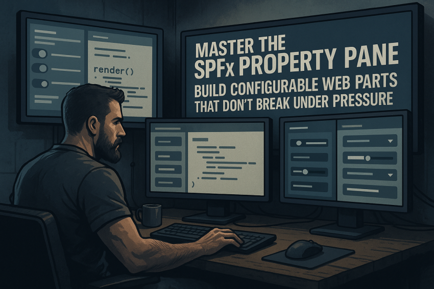
888 words, 5 minutes read time.

There’s a strange kind of satisfaction in building a SharePoint Framework (SPFx) web part that just works. No quirks. No phantom state bugs. No “why the heck won’t it refresh when I change this property” moments. It’s the software equivalent of tightening a bolt and hearing that perfect metallic click that says: solid.
But if you’ve ever built a custom web part, you know that the Property Pane can be the gremlin hiding in the gears. It looks simple—just a few toggles and textboxes—but it’s where most devs start wrestling with inconsistent states, confusing property syncs, and unexplained refresh loops.
So, let’s go deep. We’re not doing another generic “here’s how to add a PropertyPaneTextField” walkthrough. We’re going to master the SharePoint Properties Framework. The goal? To build configurable SPFx web parts that don’t break under pressure—just like the developer running them.
Why the Property Pane Exists
The Property Pane isn’t just for letting end users toggle options. It’s the communication line between your web part UI and its configuration state. Every dropdown, checkbox, and slider is effectively a handshake between your code and the person using it.
Microsoft could’ve made configuration XML-based like in the old Web Parts, but SPFx took a modern approach—dynamic, JSON-driven configuration inside the client context. That means real-time updates, dynamic controls, and flexible property definitions.
And for developers, it’s the difference between rigid, SharePoint-era “customization” and modern, React-based, reactive design.
When you master the Property Pane, you’re not just making settings. You’re giving your web part adaptability—the ability to shift shape depending on the context it’s running in. That’s powerful.
Anatomy of the Property Pane
At its core, every SPFx web part has a configuration file called manifest.json, which defines metadata like name, description, and version. But the property structure comes from the TypeScript side—where we define the property interface and connect it to the pane.
Here’s the minimal skeleton of a Property Pane setup:
// Property interface
export interface IMyWebPartProps {
  title: string;
  showWeather: boolean;
  refreshRate: number;
}
// Basic web part class
export default class MyWebPart extends BaseClientSideWebPart<IMyWebPartProps> {

  public render(): void {
    this.domElement.innerHTML = `
      <div>
        <h3>${this.properties.title}</h3>
        <p>Weather feature is ${this.properties.showWeather ? 'ON' : 'OFF'}</p>
        <p>Refresh rate: ${this.properties.refreshRate}s</p>
      </div>`;
  }

  protected getPropertyPaneConfiguration(): IPropertyPaneConfiguration {
    return {
      pages: [
        {
          header: { description: "Web Part Configuration" },
          groups: [
            {
              groupName: "Display Settings",
              groupFields: [
                PropertyPaneTextField('title', { label: 'Title' }),
                PropertyPaneToggle('showWeather', { label: 'Show Weather Widget' }),
                PropertyPaneSlider('refreshRate', { label: 'Refresh Rate (sec)', min: 10, max: 300 })
              ]
            }
          ]
        }
      ]
    };
  }
}
Handling Property Changes
The onPropertyPaneFieldChanged method allows you to react when users change values:
protected onPropertyPaneFieldChanged(propertyPath: string, oldValue: any, newValue: any): void {
  if (propertyPath === "title" && newValue.trim().length === 0) {
    this.properties.title = "Default Title";
  }
  this.render();
}
This ensures your web part never breaks, even if users leave fields empty or enter invalid data.
Advanced Property Pane Configuration
You can create multi-page, multi-group property panes with complex configurations. Here’s an example:
protected getPropertyPaneConfiguration(): IPropertyPaneConfiguration {
  return {
    pages: [
      {
        header: { description: "Display Settings" },
        groups: [
          {
            groupName: "Main Options",
            groupFields: [
              PropertyPaneTextField("title", { label: "Title" }),
              PropertyPaneToggle("showWeather", { label: "Show Weather" })
            ]
          }
        ]
      },
      {
        header: { description: "Performance Settings" },
        groups: [
          {
            groupName: "Refresh Options",
            groupFields: [
              PropertyPaneSlider("refreshRate", { label: "Refresh Rate", min: 10, max: 300 })
            ]
          }
        ]
      }
    ]
  };
}
Using PnP Property Controls
The PnP SPFx Property Controls library gives you ready-made controls like list pickers, people pickers, and collection editors.
npm install @pnp/spfx-property-controls --saveimport {
PropertyFieldListPicker,
PropertyFieldPeoplePicker,
PropertyFieldCollectionData
} from "@pnp/spfx-property-controls/lib/PropertyFieldListPicker";
PropertyFieldListPicker("list", {
  label: "Select a List",
  selectedList: this.properties.list,
  onPropertyChange: this.onPropertyPaneFieldChanged,
  context: this.context,
  includeHidden: false,
  orderBy: PropertyFieldListPickerOrderBy.Title
});
Creating Custom Property Pane Controls
Sometimes you need a control nobody else has. That’s where custom property pane fields come in:
import {
  IPropertyPaneCustomFieldProps,
  PropertyPaneCustomField
} from "@microsoft/sp-property-pane";

const customField = PropertyPaneCustomField({
  key: "myCustomField",
  onRender: (elem, context, changeCallback) => {
    ReactDom.render(
      <MyCustomControl
        value={context.properties.customValue}
        onChange={changeCallback}
      />,
      elem
    );
  },
  onDispose: (elem) => ReactDom.unmountComponentAtNode(elem)
});
Dynamic Property Pane Updates
You can hide/show fields or change options dynamically based on user selections:
if (this.properties.enableAdvanced) {
  this.context.propertyPane.refresh();
}
This lets you build sophisticated, context-aware configuration experiences.
Handling Collections
For editing structured arrays, use PropertyFieldCollectionData:
PropertyFieldCollectionData("rules", {
  label: "Configure Rules",
  value: this.properties.rules,
  onPropertyChange: this.onPropertyPaneFieldChanged,
  fields: [
    { id: "name", title: "Name", type: CustomCollectionFieldType.string },
    { id: "url", title: "URL", type: CustomCollectionFieldType.url }
  ]
});
Best Practices
- Keep the pane simple and intuitive. Only expose what matters.
- Use defaults for 90% of users.
- Validate inputs aggressively.
- Version your schema for future upgrades.
- Test every custom control and dynamic logic.
- Cache data to prevent repeated network calls.
Conclusion
Mastering the SPFx Property Pane isn’t just about code—it’s about building reliable, maintainable, and user-friendly web parts. Treat the Property Pane like a cockpit: every control should feel intentional, solid, and safe.
Now go implement these patterns in your web parts, and when you’re ready, subscribe to our newsletter, leave a comment with your insights, or contact me directly. Your SPFx creations will thank you.
Sources
- Microsoft Docs: Build your first client-side web part
- Microsoft Docs: Overview of the property pane
- Microsoft Docs: Use the property pane in SPFx web parts
- PnP SPFx Property Controls Documentation
- PnP GitHub Repository for SPFx Property Controls
- SharePoint Stack Exchange: SPFx discussions
- Medium: SPFx Property Pane Custom Controls
- C# Corner: Creating Custom Property Pane Controls in SPFx
- Microsoft Docs: Debug SPFx property pane
- Tugberk Ugurlu: SPFx Property Pane Controls Overview
- CleverWorkarounds: Customizing the SPFx Property Pane
- YouTube: SPFx Property Pane Tutorial
Disclaimer:
The views and opinions expressed in this post are solely those of the author. The information provided is based on personal research, experience, and understanding of the subject matter at the time of writing. Readers should consult relevant experts or authorities for specific guidance related to their unique situations.